.png)
.png)
Shedding Light on the Problem

Many disabled individuals live their lives feeling discouraged by their disabilities. They rely on the assistance of others to complete difficult tasks. However, some individuals don’t have kin to help them or can’t afford an aide to help them. This has caused many of them to feel stuck and limited in various aspects of their life.
Shedding Light on the Problem
In the United States, government and state-funded disability benefit programs are available. However, in order to qualify for many of these programs, applicants must be unable to work or have little or no income. What’s more, program members are automatically deemed ineligible for disability benefits once they make above a certain amount, capping the potential of financial freedom for disabled individuals in America.


Solution Proposal
With the barriers to financial stability and adequate aid in their way, disabled community members could benefit from the invention of a service that connects them with individuals who are available to help them at no cost to them.
.png)

Desired Outcome
An ecosystem where disability advocacy is at the forefront. These four stakeholders would engage in a mutual relationship where revenue can be generated and jobs can be created, all while broadening access to US disability services. The end result of this project will be a product that worth developing, one that makes all stakeholders happy.


Discovery Interviews
I sat down with 5 disabled users with varying disabilities to discuss how they live their daily lives. The objective of these interviews was to uncover the pain points that disabled users may share, and to see if the proposed product could solve a common issue amongst users.
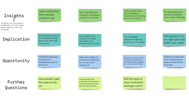
After synthesizing the qualitative data I collected, I discovered patterns in my users’ experiences, thoughts and feelings. The pain points and insights that I uncovered were:
.png)
.png)

User Types

Disabled users
Helper users
Individuals who were born with or acquired a disability that affects their daily lifestyle
Able-bodied individuals who are willing to help others in need
User Personas
.png)
User Stories


Early Designs


I utilized the Crazy 8s method to brainstorm design concepts for the main product pages. After reviewing the concepts, I took the features that I liked from each screen and combined them into one frame. From here, I took my paper designs and began to develop them further as Figma frames.
Lo-fi
.png)
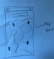
In my early concept designs, Helper users would have a map view of the various “asks” near them. Users can interact with the map and view the task information, including information about the Asker. This concept came to fruition and was developed to be part of the finalized product. (As shown right)
I created user flows for both sets of users, as I intended that the product would foster a mutual relationship between disabled users and helpful job seekers.
In my early concept designs, disabled users would be able to view a map of nearby Helpers on their landing page, as well as have the ability to fill in the Helper request form. (As shown left)
.png)
.png)
After my wireframes were finished, I created a web of connections to develop my prototype. With the first version of the product completed, I prepared for user testing.

Participants
%201.png)
The criteria for candidacy for my study were: disabled users who have difficulty doing various tasks that able-bodied individuals do, ages 16-70.
After screening a couple of individuals, I found participants who fit the criteria, all with different disabilities. This excited me due to the fact that I’d be getting feedback from users with varying disabilities, exposing the product to a diverse range of perspectives.

Obstacles
It was very important for me to recruit participants with varying disabilities for more diverse circumstances and use cases for the product. I invited a blind user whom I had talked with for my preliminary research to test the product.
The participant used VoiceOver on iOS and asked me if they could use their phone to review the prototype. After we attempted to test it out, I was shocked to find that Figma was not compatible with screen readers.
%201.png)

.png)
This surprised me. Both I and the user were disappointed to make this discovery. However, with this knowledge, I was determined to bring awareness to this issue.
I brought up my concerns to the Figma team, and I received a response saying that the company is working to make the tool more accessible.
I hope that bringing attention to this matter will bring about real change, so that I and other designers can use Figma to best serve ALL of our intended users and receive their valuable feedback.
Usability Study 1
%201.png)
From unique user feedback, I learned that:
-
Dropdowns may be more effective than text boxes for certain data collection processes
-
The app is relatively easy to use
-
Users could benefit from having multiple exit routes, during the signup process
Iterations
Using my gained insights to inform my next design decisions, I implemented changes while also increasing prototype fidelity.


Initially, I was unsure how to make the sign up process less tedious, as some users noted that it felt too continuous. To balance the user’s desires and the necessary sign up requirements implemented to ensure all relevant information is gathered, I made the executive decision to eliminate a questionnaire screen from the prototype. Being that the following screen has the same information with more detailed accessibility customization features (including screen magnification), having the questionnaire screen proved to be redundant. Eliminating this screen minimized the number of clicks it took for the user to complete the sign up flow.
.png)
After creating hundreds of connections between my high-fidelity screens, I prepared for a second round of usability testing.
%201.png)
%201.png)
Again, the criteria for candidacy for my study were: disabled users who have difficulty doing various tasks that able-bodied individuals do, ages 16-70. Reconnecting with my prior participants from my first study, I uncovered insights pertaining to the UX and UI of my high fidelity prototype.
Usability Study 2
.png)
From unique user feedback, I learned that:
-
All users reported they would use the app in their daily lives
-
Prototype adjustments were practical and aligned with user needs
-
Disability choice list may need reworking for inclusivity
2nd Iterations

Using my gained insights to inform my next design decisions, I implemented these changes. I added a drop down option for users to choose less detailed tasks in order to expedite the booking process while also potentially making it easier on users with motor skill disabilities.

Additionally, I expanded the disability list for the onboarding process, and highlighted the “Other” category for disabilities that may not have been accounted for.
The inputs from members of our disabled population are invaluable. It's imperative that segments of disabled users within a larger user base are represented, as their pains and frustrations tackle unique pains that all users may face to varying degrees. For a design team seeking to design with purpose and a company aiming to solidify product fit, considering these unique challenges yields a stronger solution.

.png)
Reflection
