ABOUT THE BRAND
.png)
Zocdoc aims to bridge the gap between medical providers and patients by providing a comprehensive appointment-scheduling platform that allows patients to view doctors’ availabilities and autonomously book appointments.
_edited.png)
.png)
.png)
THE DESIGN CHALLENGE

To keep up with the ever-changing technology space, Zocdoc’s stakeholders want to explore the capabilities of generative AI and how it could potentially enhance the Zocdoc user experience.
DESK RESEARCH
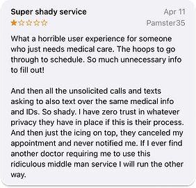
In order to justify this potential update, I conducted research to identify user pain points that might be remedied by an option to automate their booking experience. I discovered that many Zocdoc users felt frustrated with the repetitive intake processes currently implemented on the app.


PROJECT OVERVIEW
PROTO-PERSONAS
.png)

With diverse stories and similar goals, these personas conceptualized the uniqueness of each Zocdoc user while putting the focus on the problem we aimed to solve.
USER FLOWS
%201.png)
%201.png)
As I dug deeper to discover common user behaviors while interacting with the app, I developed user flows based on our personas to map out our users’ potential interactions and the pain points they might experience along the way.
WIREFRAMES
.png)
%20(1).png)
I built my low-fidelity wireframes around the current app layout. Using the current interface as a guide, I began my design process and brainstormed ways in which the AI feature could be implemented.
After deciding on a creative direction, I began to iterate on my design, developing a mid-fidelity prototype. This version of my prototype would serve as the test product in my first round of usability testing.
.png)
DESIGN SYSTEM
.png)
.png)
To reinforce the cohesiveness of the end prototype and the current app’s aesthetic, I created a design system that served as a style guide for my wireframes. Over the course of this project, I reiterated and added components.
PROTOTYPES
.png)
After creating the necessary connections in Figma to construct my first prototype, I created a research plan with the goal of understanding potential user pain points while navigating the proposed feature and justifying its addition to the interface through user research.
USABILITY STUDY 1
By conducting an A/B study using the current Zocdoc booking experience and the prototype, I gained valuable insight on users’ feelings towards the AI update. The goal of the update is to simplify the booking experience for current Zocdoc users. I found that the average user opinion was positive, and many users made comments about how the compartmentalization and organization of the information made it much easier to process due to the text bubble response style.
Other users mentioned that they felt like they were being “guided” through the booking process. However, I discovered intriguing attitudes towards AI from a minority of our user base, uncovering the diverse opinions users have concerning AI’s rising prevalence.
.png)
.png)
.png)
DIGGING DEEPER
In the pursuit of understanding the pain points of our dissatisfied user base, I dug deeper to the root cause of their negative feelings towards the product. I learned that a particular user had strong negative feelings towards AI, which seemed to impact how they felt about the product as a whole. In order to test this theory, I knew I would have to reiterate my designs and conduct a second round of studies to examine the possibility of implicit bias.
.png)
HUMANIZING AI
.png)
One of the prominent reiterations I made to my prototype was changing the way the AI bot presented itself. In an attempt to physically humanize the AI bot to satisfy the innate desire to engage in human interaction, the bot was changed to a picture of a doctor. This change would prove to make all the difference for some users. As I continued to utilize user feedback as my guide for updates, I prepared for my next round of testing.
APPLYING FEEDBACK
.png)
After adding more connections in Figma for added prototype interactivity, giving the AI feature a unique layout using color, and following user advice, the second round of iterations were complete.

USABILITY STUDY 2
The findings from the second study were highly fascinating. User feedback uncovered just how much psychology can be used to improve designs. Testing the new product with the same users, I found that all users felt that the update made the booking process easier, even those that were dissatisfied with the process previously. I followed up with the user who outwardly voiced their disdain for AI, asking whether the update changed their feeling towards AI’s use within the product, and if so, how?
.png)
I learned that those who are threatened by or share disdain for AI can potentially be appeased by interacting with AI that resembles humans. This can help users reap the benefits of AI’s automation capabilities while allowing them to feel more comfortable while using it by mimicking typical human-to-human digital interactions.


.png)
.png)