_edited.png)

How I co-founded Crowe's AI Innovation Lab and shipped AI tools for 8,000+ employees.
Role
AI Innovation Experience Designer (Assistant Director)
Company
Crowe LLP
Team
AI Lab
Timeline
Sep 2024 - Jan 2026
Note: Original screens can't be shown due to confidentiality obligations at Crowe. All visuals in this case study are Figma reconstructions created to illustrate the design decisions. Outcomes and metrics are factual.
Context
Crowe LLP is one of the top 10 public accounting firms in the US. In late 2024, the firm launched its AI Innovation Lab, a new business unit charged with evaluating, building, and deploying AI-powered tools across the organization. I was the fourth hire and the only UX professional on the team. My colleagues were AI technologists, not designers. There was no existing design system for AI products, no research protocol, no playbook. Everything I built here was built from scratch.

“I thought I'd be designing interfaces. Instead, I co-built an AI lab and, in the process, designed some of the most technically complex and impactful products of my career.”
Design Challenge 1: OCM AI Assistants
PROBLEM

.png)
.png)
Crowe's Organizational Change Management (OCM) team needed a way to give employees on-demand access to OCM guidance and resources during a period of significant organizational change.
The brief was simple on the surface: build a chatbot. But the complexity was in the constraints. Crowe's employees sat across multiple access tiers; some had ChatGPT Enterprise, some had Microsoft Copilot, some would only ever access a chatbot through Crowe's proprietary LLM. One experience needed to work across all three platforms, with different technical limitations on each.
RESEARCH AND DISCOVERY
I was paired up with a subject matter expert from the OCM team and given learning materials to get up to speed on organizational change management as a discipline. Before touching any design, I ran stakeholder interviews with the OCM team to understand:
-
What questions employees actually asked during change initiatives
-
Where current support channels were breaking down (too slow, too generic, not available at certain times)
-
What 'accurate' looked like for OCM guidance (what the SME would approve versus flag)
-
What the risk surface looked like if the AI gave wrong or outdated information
This research shaped the entire design direction. The biggest insight: employees didn't need the AI to be brilliant. They needed it to be consistently trustworthy and to know its own limits. A chatbot that confidently gave wrong OCM guidance was worse than no chatbot at all.

DESIGN DECISIONS
1. Designing for trust, not just accuracy
I built the knowledge base and instruction prompt to prioritize confident scope over broad coverage. The assistant was designed to answer clearly within its knowledge domain and escalate gracefully when it couldn't — pointing users to human OCM resources rather than guessing. Every response included a clear framing of what the assistant was and wasn't: a guidance tool, not a policy authority. That distinction mattered for user trust and for the firm's risk posture.

.png)
2. Multi-platform deployment as a design systems problem
Shipping the same experience across three platforms (ChatGPT Enterprise, Microsoft Copilot, and Crowe's proprietary LLM) was less of a conversation design problem and more of a design systems problem. Each platform had different:
-
Rendering capabilities (rich text vs. plain text)
-
Context window limits (affecting how much guidance could be surfaced at once)
-
Persona configuration options (how much I could control the assistant's tone and behavior)
-
Access and authentication patterns (which employees could reach which version)
I mapped these constraints into a decision framework that let me design the core experience once and adapt it systematically for each platform rather than treating each as a separate product.

3. Iterative testing with the SME
I ran structured accuracy testing sessions with the OCM SME and her colleagues before each deployment. I tracked questions the assistant answered incorrectly, questions it refused when it shouldn't have, questions it answered too confidently, and refined the instruction prompt through multiple rounds of iteration.
This was prompt engineering as design research. Each round taught me more about where the model's reasoning diverged from what an OCM expert would actually say, which shaped both the prompt design and the escalation patterns.
-
Shipped 3 firmwide AI products in the first 3 months within my role
-
8,000+ US employees gained on-demand OCM guidance on day one
-
Successfully deployed across ChatGPT Enterprise, Microsoft Copilot, and Crowe's proprietary LLM
-
Zero critical accuracy incidents in the first month post-launch (per OCM team feedback)
OUTCOME

Design Challenge 2: AI Lab SharePoint Page
PROBLEM
The AI Lab needed a home. Somewhere to showcase its work, attract internal clients, and capture interest from employees who wanted to stay connected. The firm's standard channel for this was SharePoint. SharePoint is not a design-friendly platform. But because the site needed to exist within Crowe LLP’s SharePoint-based “Nest” ecosystem, the experience had to be designed around strict platform limitations. Its page builder offers limited layout control, no custom CSS, and rigid component options. For a team trying to signal that it was doing cutting-edge AI work, an amateur-looking SharePoint page would have undermined the message. The goal was to create a dynamic, modern AI innovation hub while working within constrained customization and plug-in capabilities, requiring thoughtful design solutions that maximized flexibility within the existing system.

DESIGN DECISIONS
Constraints as a design problem
Rather than fighting SharePoint's limitations, I worked within them deliberately.
Here's what I did:
-
Used embedded HTML to incorporate video content and dynamic elements that SharePoint's native builder couldn't support
-
Applied Crowe's visual brand guidelines to create visual consistency within the constrained layout
-
Designed a clear information hierarchy that led visitors from the Lab's mission → its key projects → email capture, with each section doing specific persuasive work
-
Wrote all copy myself, treating the page as a content design problem as much as a visual one
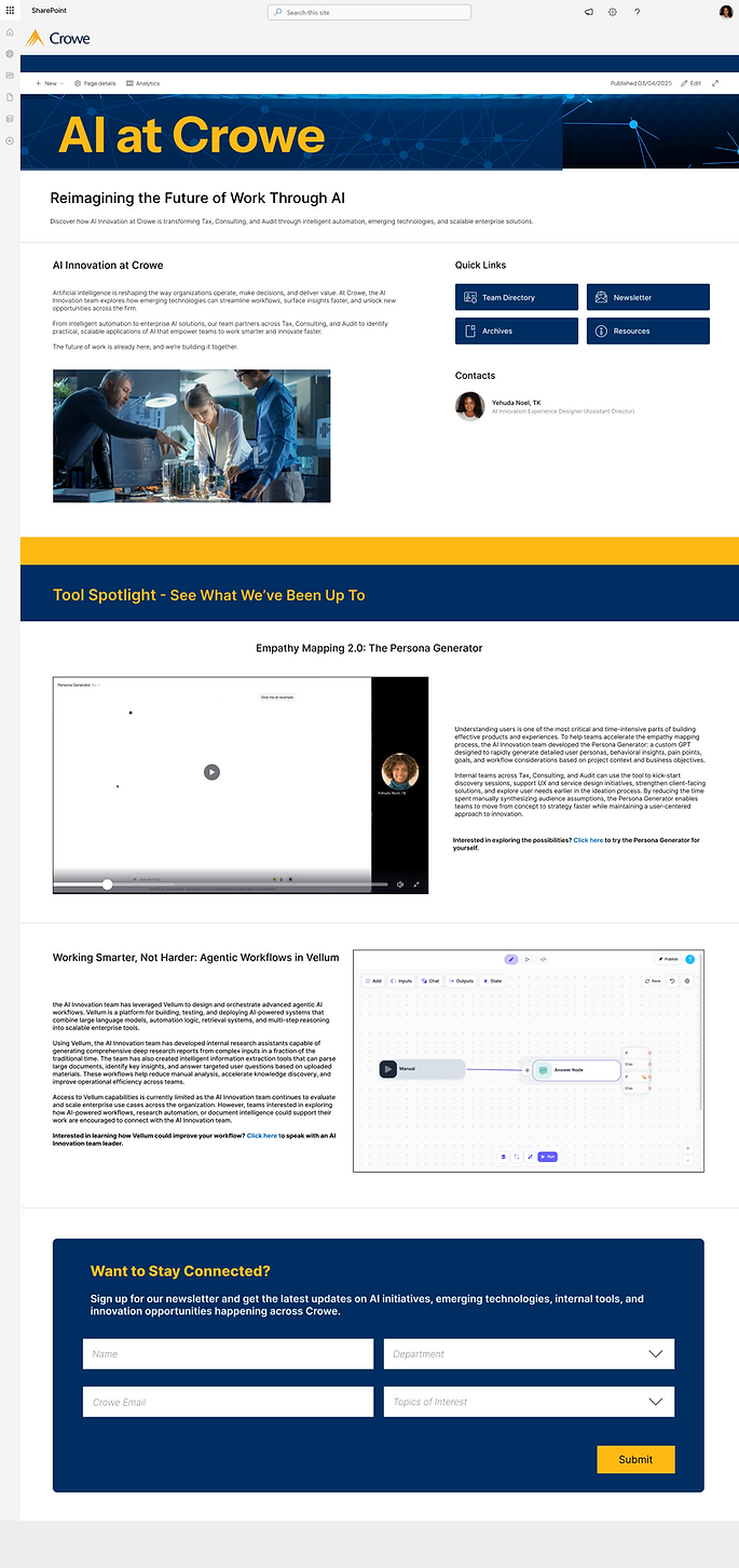
Adherence to Crowe's established design guidelines (HEX #002D62, #FDBE23, #FFFFFF)
Shortcuts for quick team contact list and resource access (available tools, research).
Direct access to AI Innovation leadership through Teams redirection.
Leveraging AI
Showcasing Team developments by utilizing embedding tool for video player.
Intentional tool spotlights geared towards visionary adoption across business units.
Email capture form for more communication opportunities across the firm.
OUTCOME
A website showcasing the best of the AI Lab's work - adherent to company guidelines.
Reflection:
Things I Learned Designing for the Lab
These days, the hardest AI UX problem is trust calibration. Getting users to trust AI outputs at the right level (not too much, not too little) is a design problem that requires deep understanding of both the user's mental model and the AI system's actual capabilities and failure modes.
Agentic workflows need observable steps. When an AI system is making multiple decisions in sequence, users need to be able to see what's happening at each step and intervene before errors compound. Hiding the pipeline is a design failure, not a simplification.
Research integrity matters more in AI contexts than in traditional product design. The stakes of designing based on bad data are higher when the product you're building will make autonomous decisions.