Modernizing the Digital Experience for a Luxury Grooming Brand
I redesigned Trim NYC's digital experience to improve customer communication, streamline development handoff, and create a scalable foundation for future growth.
Quick Overview
Role
Founding Product Designer
Duration
12 Weeks
Team
Founder, Developer, Designer (me)
Deliverables
UX Strategy, Information Architecture, UI Design, Design System
Outcome
Improved communication, aligned stakeholders, launched redesigned experience
.png)
Business Challenge
The app wasn't the real problem.
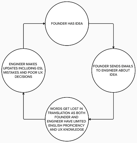
When I joined the project, the website appeared to be the primary concern. However, stakeholder interviews and project discovery revealed a deeper issue.
Communication between customers, business stakeholders, and developers was fragmented. Requirements were scattered across emails, feedback loops were difficult to manage, and design decisions often became lost during implementation. On top of that, both the founder and engineer were working with limited proficiency in English, the only language they could communicate in.
The challenge wasn't simply redesigning a website. It was creating a shared understanding of how the digital experience should work.
Understanding the Ecosystem
Before creating solutions, I needed to understand how customers discovered, evaluated, and booked services through Trim NYC.
Through stakeholder discussions and journey mapping, I identified several friction points:
-
Inconsistent messaging
-
Confusing navigation paths
-
Unclear service information
-
Limited alignment between business goals and digital touchpoints
These findings informed both the site structure and future design decisions.
.png)
Creating a Unified Vision
One of the project's biggest challenges was ensuring that business objectives, customer needs, and technical constraints remained aligned throughout the design process.
To bridge these perspectives, I translated abstract conversations into tangible artifacts that stakeholders and developers could discuss together.
This reduced ambiguity, accelerated decision-making, and created a stronger foundation for implementation.

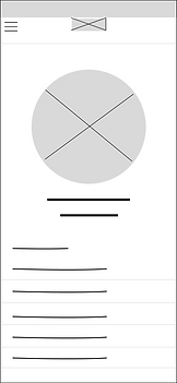
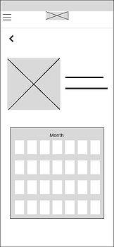

Designing the Experience

.png)
.png)
The redesigned experience focused on helping customers quickly understand Trim NYC's services, build trust in the brand, and confidently move toward booking.
Key priorities included:
-
Clearer information hierarchy
-
Improved service discoverability
-
Consistent visual language
-
Stronger calls to action
-
Mobile-first usability
Every design decision was evaluated through the lens of customer clarity and business impact.
Designing for Developers
Design doesn't end when mockups are approved.
To support implementation, I created detailed specifications and organized design assets in ways that reduced ambiguity for developers.
This helped translate intent into execution while minimizing back-and-forth clarification requests throughout the build process.
Launching a More Cohesive Experience
The final solution delivered more than a visual refresh.
The project established a clearer customer journey, improved stakeholder alignment, and provided developers with a structured framework for implementation. Beyond the launch itself, the work created a scalable digital foundation capable of supporting future business growth.
%201.png)
Reflection
This project reinforced an important lesson:
Many design challenges initially present themselves as interface problems when they are actually communication problems.
By focusing on alignment between customers, stakeholders, and developers, I was able to create a stronger solution than a website redesign alone could achieve.
The experience strengthened my belief that effective design often means reducing ambiguity across an entire system, not just improving what users see on screen.